Designing a modern, credible, and conversion-ready website for a global WiFi provider
WifiOne- A Case Study by Bijoy Paul
Overview
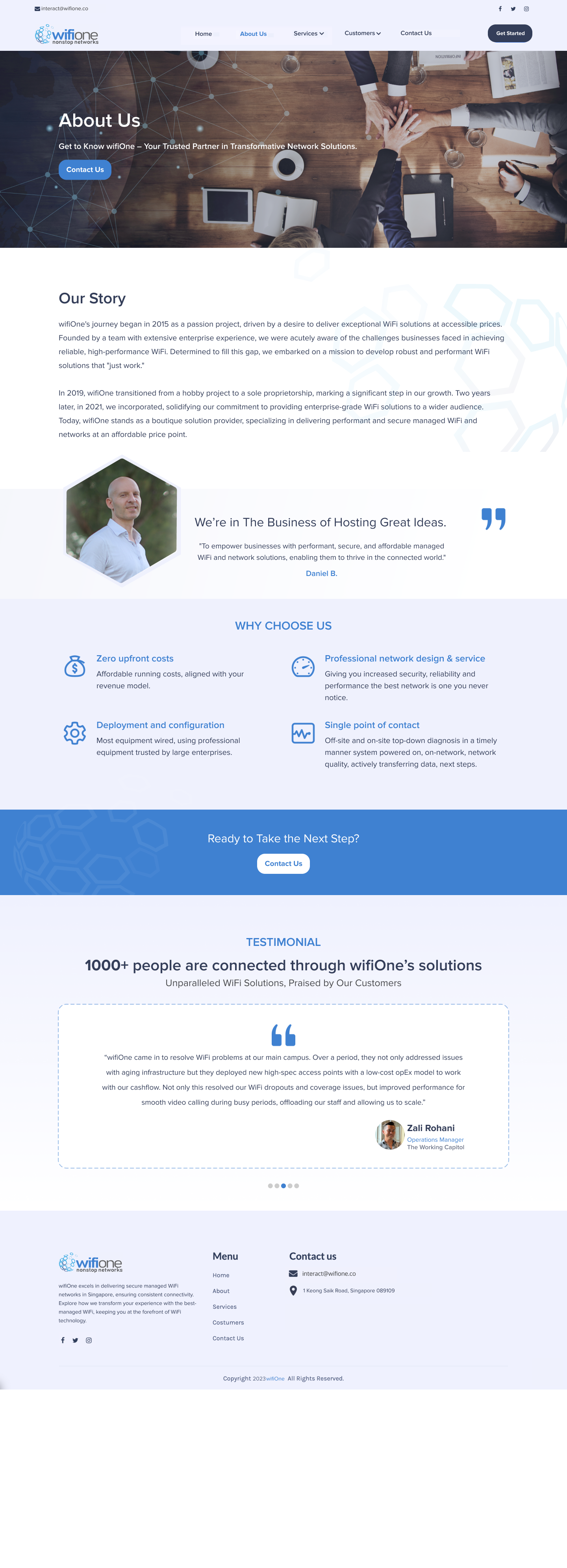
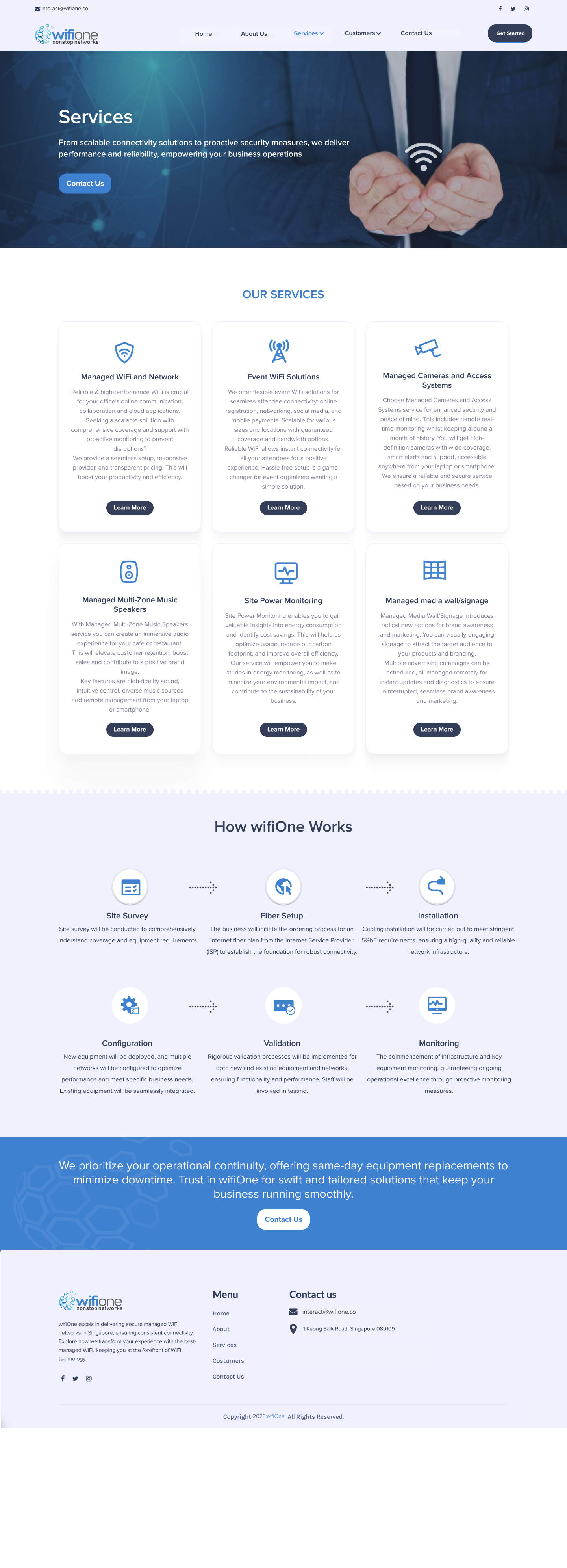
wifiOne is a managed WiFi solutions provider specializing in enterprise-grade network connectivity, security, and monitoring. The goal of this project was to redesign the company’s existing web presence into a clean, professional, and trust-driven static website that clearly communicates its expertise while appealing to both corporate and event clients. The final design emphasizes reliability, scalability, and simplicity — core values of the brand.

Objective
To design a corporate website that presents wifiOne as a credible, forward-thinking technology brand, highlighting its expertise in managed network solutions while ensuring intuitive navigation, professional aesthetics, and responsive adaptability.
Role
As the Lead UI Designer, I was responsible for designing the entire website structure and layout to reflect the company’s professionalism and technical strength. My work involved defining the page hierarchy, crafting clean visual compositions, selecting a color scheme aligned with the brand’s identity, and ensuring the content maintained a logical, easy-to-navigate flow. I also created reusable UI elements for consistency across multiple pages such as About, Services, and Customers.
Design Process
Understanding the Brand and Users
The project began with an analysis of wifiOne’s market positioning and user expectations. The target audience included business owners, IT heads, and event companies looking for reliable WiFi deployment and support solutions. The tone needed to feel trustworthy, technical, and global.
Key insights:
- Users value transparency in service details and pricing models.
- Simplicity in presentation creates a stronger impression of reliability.
- Visual consistency and structured typography build professional credibility.
Information Architecture & Flow
The website was structured to follow a clear storytelling and service flow, ensuring every page supports both awareness and conversion. The Home page establishes trust, the About page narrates the company’s story, the Services page demonstrates expertise, and the Customers page showcases successful use cases and testimonials. This logical sequence helps users quickly understand the business, its offerings, and its credibility before engaging through contact CTAs.
Visual Design System
The design language reflects clarity, structure, and reliability — qualities essential for a network solutions company.
- Color Palette: Shades of blue and white convey trust, stability, and technology.
- Typography: Clean sans-serif typefaces for readability and technical precision.
- Icons & Illustrations: Custom line icons reinforce clarity and reinforce visual hierarchy.
- CTA Buttons: Rounded CTA buttons in brand blue for high visibility and uniformity.
Interaction and User Experience Focus
The website was designed as a static build optimized for responsiveness and readability across all devices. Visual rhythm and whitespace were used to enhance scannability. Consistent CTAs encourage users to connect without overwhelming them. Hover feedback on cards and buttons provides subtle interactivity, making the design feel lively and modern.
Design Approach
The design of wifiOne was guided by clarity, consistency, and trust. Every element was structured to make information easy to absorb while maintaining a professional tone. Consistent use of blue tones, clean typography, and balanced spacing created visual harmony. A clear hierarchy ensured users instantly found what they needed, and thoughtful white space improved focus and readability. Above all, the layout built credibility through simplicity, helping the brand feel dependable, modern, and human.
Outcome
Delivered a clean, modern, and professional web presence that elevated wifiOne’s credibility and user experience. The static design now communicates reliability, enhances engagement, and establishes a strong digital identity for the brand.